personal work, 2021.
Gouache, water-soluble pastel, and coloured pencil, on scrap paper. About 8x10cm.
personal work, 2021.
Gouache, water-soluble pastel, and coloured pencil, on scrap paper. About 8x7cm.
personal work, 2021.
Gouache, water-soluble pastel, and coloured pencil, on scrap paper. About 8x10cm.

personal work, 2021.
Gouache, water-soluble pastel, and coloured pencil, on scrap paper. About 8x7cm.

personal work, 2021.
Gouache, water-soluble pastel, and coloured pencil, on scrap paper. About 9x11cm.

personal work, 2021.
Gouache, water-soluble pastel, and coloured pencil, on scrap paper. About 10x10cm.
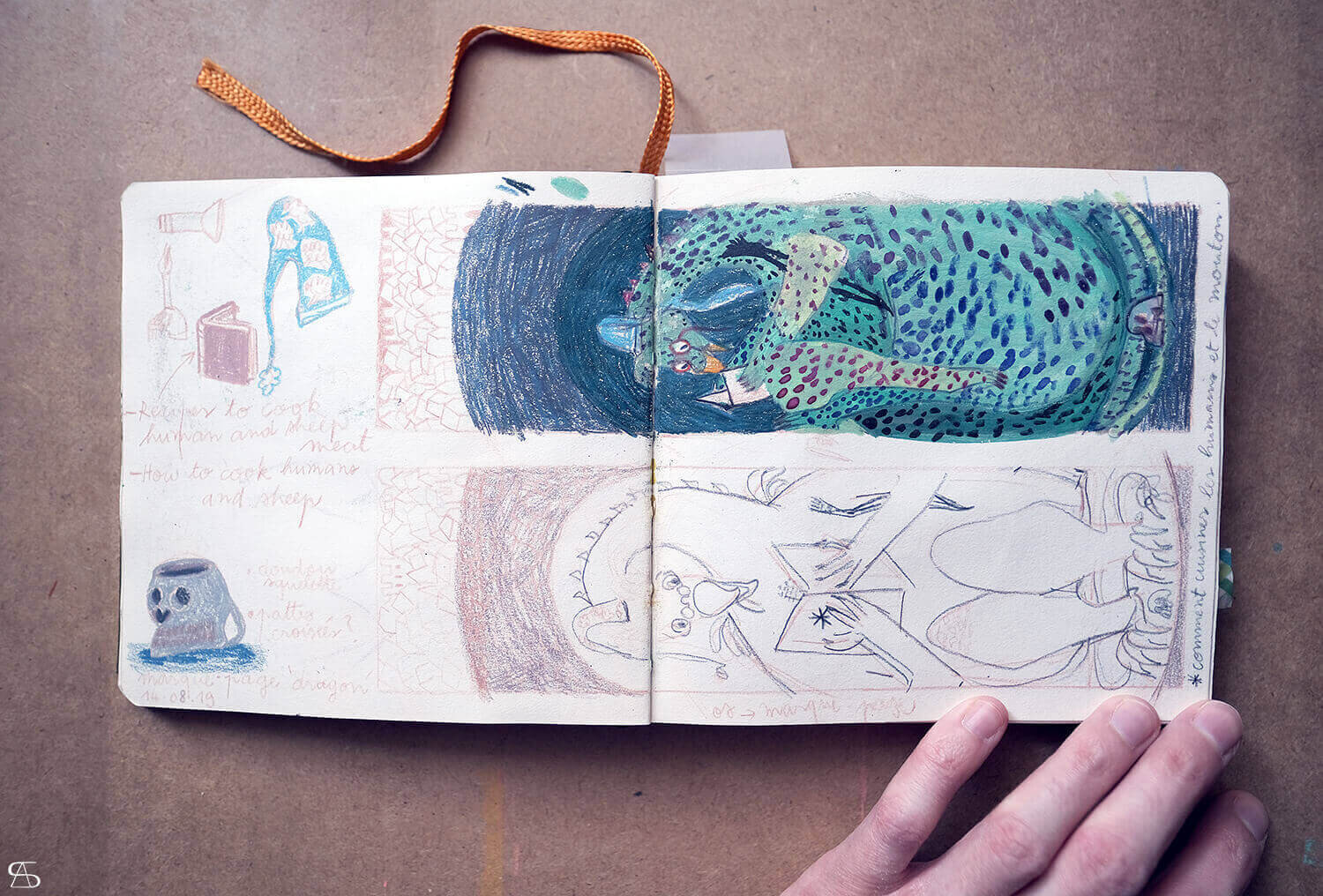
This is where it all began. Where it always begins actually: in the pages of my sketchbook. On August 14th 2019, to be precise.
I was thinking about making a new bookmark (my seventh one!). I love that kind of papercraft, and I have been collecting bookmarks since I started reading books. So why not making them myself from time to time, eh?
The year 2019 saw a lot of dragons in my work. I had the wonderful opportunity, once again, to illustrate a tale for Baïka Magazine, and not just any tale! I got asked to illustrate one of my favourite (Polish) legends: the Wawel dragon!! A few months later, I was to develop a creative workshop that went in line with the tale. And then came the signing session at the Salon du livre et de la presse jeunesse in Montreuil, where I spent my time drawing dragons.
It was therefore natural that a dragon should appear in my next bookmark.
As I had a lot of work under way at that time, the project was put on hold. Until this year. Yes. This year. Well, better late than never…
Now that the bookmark is finally finished, I would like to share with you the whole process.
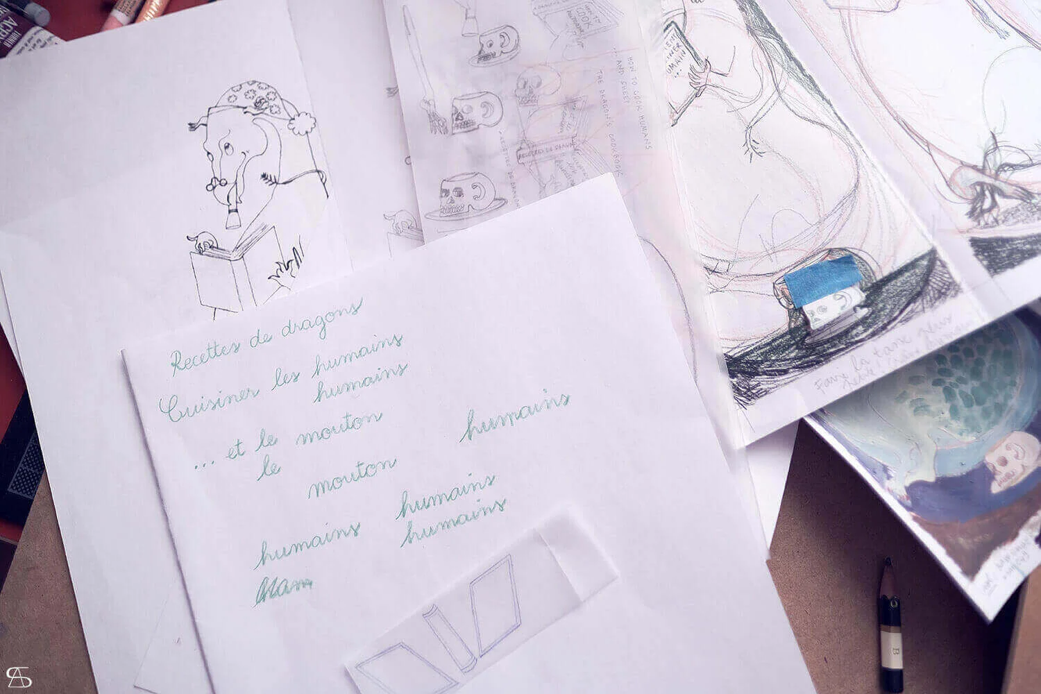
First of all, let me show you the heap of papers. What you see below are all the drafts and attempts I needed to make, in order to be able to complete the final illustration.

I had to figure out the best course of action for:
the shape and posture of the dragon.
the whole composition so as to fit in all the elements I had in mind; find a right balance between each one of them, while trying not to overload the illustration with far too many details.
the colour palette (my favourite part).
The idea was to tell in one picture how I see the Wawel dragon enjoying its free time, when it is not out of its cave hunting living creatures. As my intention was to make a bookmark, I wanted the activity of reading books to be the central theme again; and therefore I set about depicting the dragon reading a book. What would the Wawel dragon like to read? And how would it read its book? Does it drink coffee, or tea? Or something else perhaps? In my humble opinion, a dragon needs a night cap, a blankie, a flashlight, and a hot beverage, in order to read comfortably. Add reading glasses to the list. That dragon loves hunting, and loves eating, so it will definitely be reading some cookbook!
The size of a finished bookmark is about 5x20cm, but to avoid feeling hindered by it (my eyesight is not that good, and my paintbrushes not that thin!), I chose to draw and paint on a larger piece of paper, which was about 9x31cm. Once done, I would scan the illustration, have its size reduced, and ready for printing.
It has been a challenge to endeavour to achieve a successful composition, because the format is rather unusual when one looks at the width in proportion to the height. The dragon would have to be drawn in a sitting posture. And I would have to keep the bleeds in mind (the trim area of the printing piece).
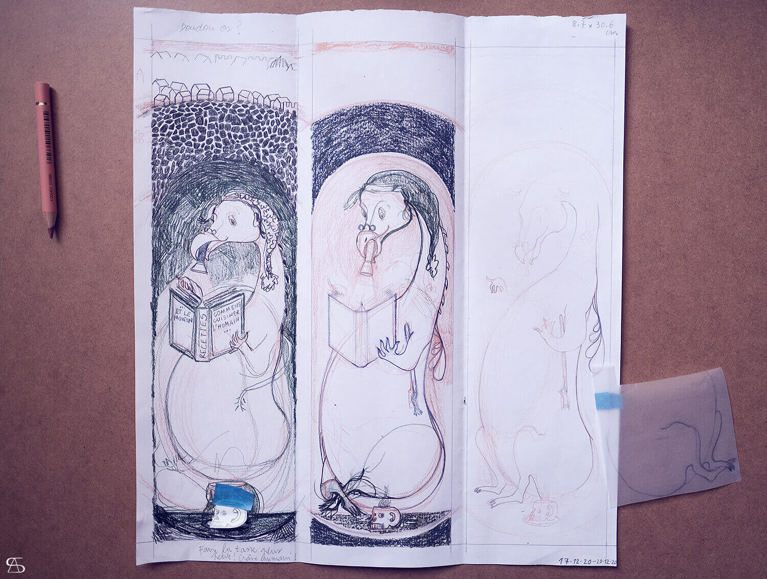

The creative part of the mind burst while I looked for ways to draw my sitting dragon. It was exhilarating, and nerve-racking at the same time.
I wish I could put into words the joy I felt when I figured it all out, and shouted inwardly ‘Bingo!’ That gave me new momentum, after having undergone long hours of sheer frustration telling myself ‘That’s it! Let’s give up!’.
Tracing paper has always been a very useful tool to reach precision, and to save time when making corrections. I used quite a lot for that project in particular. It helped me place the dragon as best as possible, to go well with the other components of the illustration, and to avoid the trim area. It also enabled me to reposition a few things without having to start all over again, such as the mug and the flashlight.

I like the way I have drawn the dragon’s hind legs, and how the tail (like a nice scarf) wraps around its neck.
Besides working on the shape of the dragon and refining it, I thought about colours (see below). Colours... O sweet and beloved colours!
When the drawing was finished, I didn’t paint directly on it. Not until I managed to get a clear idea of the palette I wanted to use, and limit the range of colours as much as possible (I am crazy about colours!). It took me several drafts before feeling confident enough.


I scanned the finished drawing, made a few adjustments, and enhanced the contrast of the image so as to use it as a basis for tracing onto another piece of paper.
I also took some notes on the final colour palette that I kept near me while working.


It was only after I was completely done painting the whole illustration, that I dealt with the writings on the dragon’s book.
I wrote down the title of the book on a separate scrap of paper that I scanned, and then added it to the illustration on Photoshop.
Here is below the completed illustration. The bookmark will be printed out soon, and it will be available to purchase in my shop :)

The Cookbook
personal work, 2021.
Gouache, coloured pencil, and water-soluble pastel, on mixed media paper. About 9x31cm.
Each new year brings its share of resolutions (some very ambitious), but most of the time their silly amount makes it daunting to keep them all. Nowadays, I am very happy when I manage to keep a single one.
There was an important resolution I kept postponing, to finally ignoring it until the next new year’s eve at midnight, which was the complete redesign of my website (including my blog and shop)… And 2021 was it! At long last. It took me more than a month to make a website by the book, but I did it! And today, I would like to share with you the research and work behind my new website header.
Why? Because those simple lines did not come out of thin air, without the slightest effort. They did not appear on a piece of expensive paper from a skilled artistic hand right after a good night’s sleep. Far from it. It took me a lot of time and work to get there. And above all, to be satisfied with the result. I thought that maybe some of you would be interested in seeing how the whole process unfolded, and notice that sometimes the most simple drawings are far from being simple to make (at least for me haha).
When I set myself to redoing the whole website from scratch, one of the things I had to consider in the first place was the ‘visual identity’ of St.Ainolopa. I intended to create one picture that would encompass as a whole the kind of work I had been doing since 2008. I did not want to just write down my name at the top of the website (I am a picture maker above all else), but to also have an illustration that would represent me as best as possible, and which would be used as a kind of signature. I would have to make it simple though.
Simple I say? My biggest problem is to keep things simple, and not overdoing it.
The challenge I was to face was mainly the boundaries set by the final image size. I was very limited as to what I could draw or paint, because the illustration would have to fit in the top left-corner of the website, right beside the main navigation bar. There was not much room for the creative mind to let loose, but in the end that turned out to be a very good exercise for me. Thus, I had to forget about putting too many details and using too many colours. I would have to tend toward clean lines, as close as possible. Keep it simple and clear like a logo, without actually making a logo. And the banner should not outshine the visual content on a website! I needed to make it appealing to the eye, but not too conspicuous.

To begin with, I went through all of my work since 2008, in order to get an overview, and enable the inspiration to kick in. I also checked all the visuals I had made for my previous website, blogs, and shops. That approach was a way to clearly see my ‘pattern’, what I had liked drawing the most those past years, the different styles, and actually make out what represented me the best.
And learn something from my past mistakes.
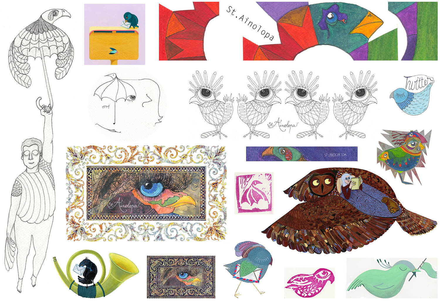
Here is a glimpse of the different visuals I made for my blogs, shops, website, and paper goods, between 2009 and 2019.
My former visuals looked most often overloaded, and quite illegible when their size got smaller. I also used to draw too many lines, and put too many colours. What I have learnt is that I always have to bear in mind the subsequent adjustment of height and width of the picture I am making. I usually work on A5 or A4 sized paper (sometimes A3); the illustrations are always bigger than the final visuals displayed on the website. When a picture has its size reduced, all the details get crammed together. That is why, in the end, everything looks ‘heavy’ and illegible.
Furthermore, I had a look at my old blog as well as my old website, and I realized there was a lack of balance between the form and the substance. The form was a bit too distracting as there were too many decorative visuals to be seen at the same time. And the latter increased the page loading time considerably... I had to keep in mind that nowadays a website and its blog are expected to be responsive.
Let us not forget about the information given in the website header: my name, and what I do. This time I wanted to put there my whole name and surname, together with the nickname I have been using on the Internet. All the more reason to simplify the drawing as much as possible, so the eye of the viewer does not get completely lost, and manages to pinpoint the relevant details (there is quite a lot!).
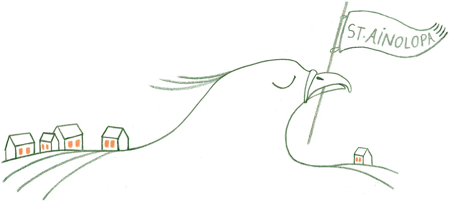
The overview of all my work made it crystal clear for me that I draw my creative fuel mostly from birds and houses. They have always been an inspiration to me no matter how many times I draw or paint them. They constantly provide the degree of freedom of gesture I need, in order not to feel hindered by the ‘not-good-enough’ thoughts plaguing my mind when I start working. Their lines and shapes have a positive effect on me; they have never been disheartening nor scary, but rather comforting to draw. They have indeed fostered my creativity and inclination to make pictures, to this day.
Birds and houses are characteristic of my work. Therefore, they should be embodied in my website header one way or the other.

This blog post is also a good opportunity to show the many ideas I had, and not let them be completely forgotten in the darkness of my cardboard sleeve, and sketchbook, sitting on a dusty shelf.
One can see that I have made a lot of sketches. It has not been an easy task for me to get to the final illustration. It was a long process, many failures were encountered along the way. A lot of thought was given, and I tried many things. I did not get from A to Z right away, I had to go through all the letters of the alphabet, so to say :)
Not to mention that at the end I had to make a choice, and had trouble deciding.

In retrospect, I could have stopped right there, right after that first page completed in my sketchbook (see above). I could have chosen one drawing, and start reworking it. But no. I was not satisfied at that point, and continued searching…


Last year, I was commissioned by a private client to paint a phoenix. I filled my sketchbook with manifold of them (see below a peek), and some birdheads stuck in my mind to keep me company while I started working on my new website header. Those sketches helped me a lot figuring out what I wanted exactly.

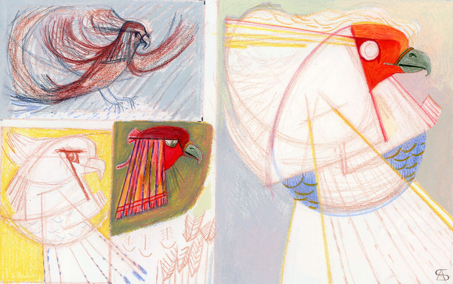

Especially that one:


There were lines I liked a lot in each shape of the birds I made, but I could never be content with the whole. So I used tracing paper to keep some of the lines, add new ones to them, and see where it would take me. I spent much time quibbling over details, and I enjoyed it tremendously (so long, the plan to make it simple for me).


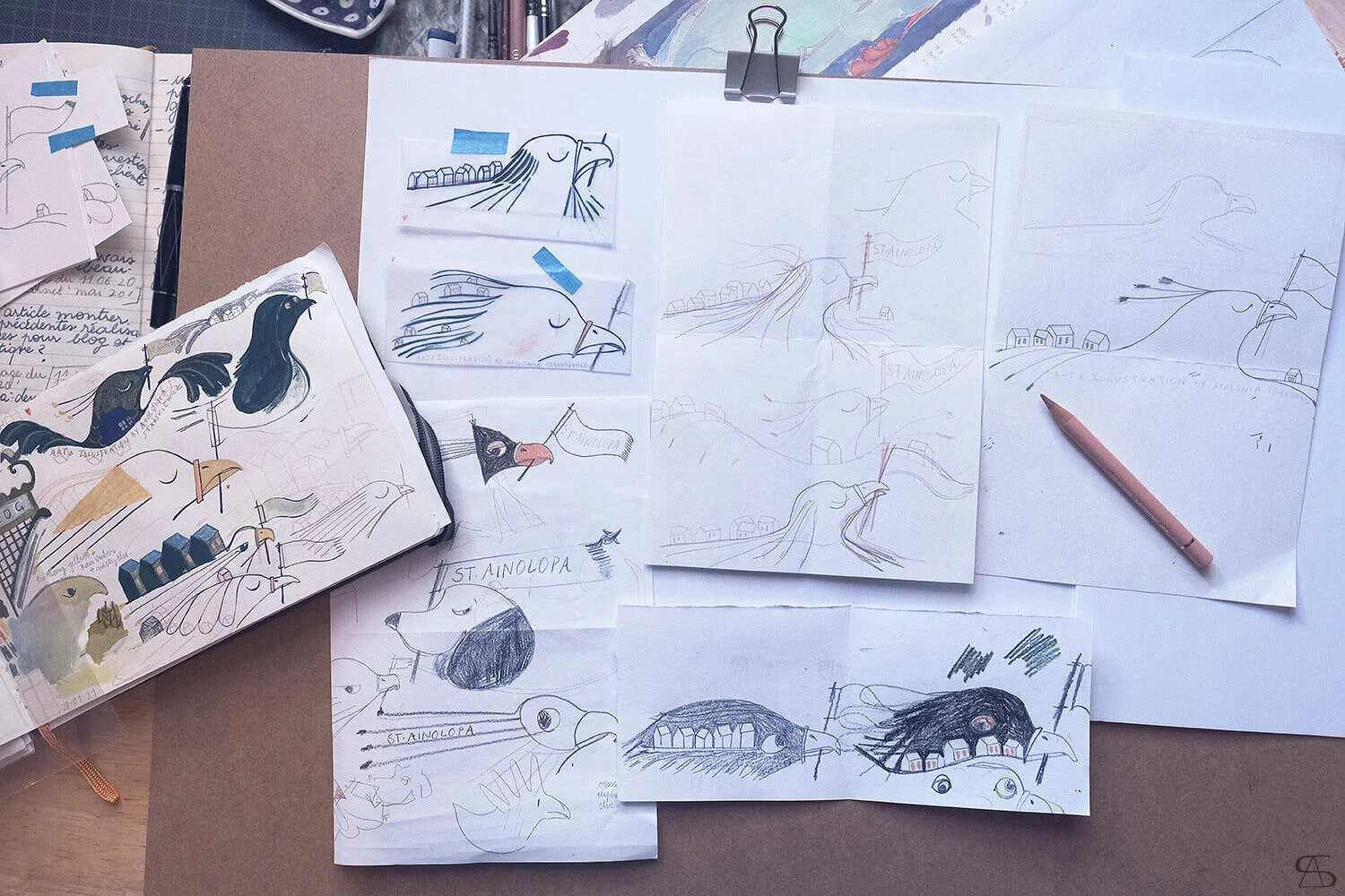
My ‘Eureka’ moment occurred in the drawings you see on the photo below. That is when I figured it all out. My new website banner was emerging, at last!


But even after the drawing was made, I was not completely done.
I had to rework a few elements several times, to make the drawing as clear and readable as possible. That is the flag, and the letters of St.Ainolopa. And every time I had to check if it was all good by scanning the reworked drawing, and by having its size reduced to fit the main navigation bar. And every time I would notice that the lines tended to overlap, and looked uneven in terms of thickness, and I would have to make some adjustments again.
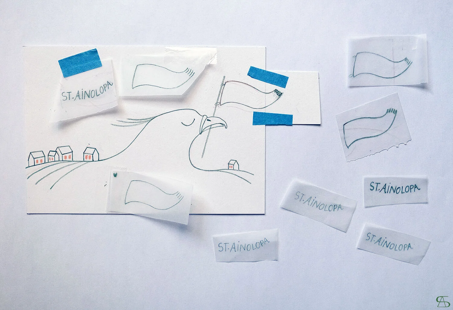
I used tracing paper for the final adjustments, and chose to use coloured pencils. I decided on two colours: ‘Juniper’s Green’ by Faber Castell Polychromos, and ‘Salmon Pink’ by Holbein Artists’ Colored Pencil.
Once I was really done, I scanned everything, rectified (again!) some of the lines and letters on Photoshop, and cleaned the white background.
Et voilà !


